For this individual assignment each member of the group had to analyze two papers from a list of documents related to the lectures that we had during the course. I have chosen to use F2 – Flow in Games (and Everything Else) and F5 – Developing Gestalt-based Design Guidelines for Multi-sensory Displays, as both papers explain frameworks implemented in Human Computer Interaction. Moreover, both papers also implement concepts from psychology and human cognition. I believe that this will contribute to our final project in both pragmatic and theoretical levels. Applying all these frameworks and concepts can be help our project improve the overall design quality and user interaction satisfaction. This is why I this these two papers are a good fit for this final task.
From F2 – Flow in Games (and Everything Else)

Summary
In this paper introduces us to Csikszentmihalyi’s concept of flow. A concept he coined in the mid 1970’s while researching in the field of positive psychology. Flow refers to a positive feel of engagement during an activity, with a high level of enjoyment and fulfillment. During a state of flow, the user experiences some level of temporal mania, in which he or she is completely focus on the activity and forgets about everything else. This feeling can be result of different kind of activities people engage in, that evolve in different lapses of time. Moreover, Csikszentmihalyi recognizes eight different conditions that conform the flow, nonetheless not all of these are required for an experience of flow. These experiences are, verbatim from the text:
–A challenging activity (requiring a skill)
-A merging of action and awareness
-Clear goal
-Direct, Immediate feedback
-Concentration on the task at hand
-A sense of control
-A loss of self-consciousness
-An altered sense of time
After introducing the concept of flow, the author of the paper, implements it to video game development. This major entertainment medium of the XXI century is also a vehicle to achieve this state of flow. He suggests that gamers will value a game according to the level of flow they get when they play it. How much players engross in a game, what level of mental engagement and investment is achieved, is directly related to the level of flow they get. This is no fortuity; most game developers deliberately apply these concepts when designing a video games. These principles apply, not only in the video game industry, but in any sort of digital interactive experience. It’s the main duty of a good designer to make sure that the user of a system is always on the zone, that area that the author defines as the perfect level of flow during the user experience. This is done by achieving a good balance between challenge and user abilities with none overpowering the other. Overpowering user abilities will generate boredom (too easy) and overpowering challenges will generate anxiety in the user (too difficult). Moreover, when designing an interactive experience, designers must have in mind that not two people experience the same thing the same way. What is more, users learn to navigate and interface quickly or develop the necessary skills to master a videogame, so some sort of challenge should be added to keep users in the zone. These experiences must be dynamic and interactive, and must include a broader audience of users by providing customization of the user’s personal flow. The best way to achieve this without interrupting the flow, is to offer adaptive choices and embedding customization as part of the central core of the experience.
Discussion
I think this is a very interesting paper in both psychological and practical design levels. After all, human computer interactions are designed as a medium to communicate and convey ideas, and even entertain the user in case of video games. These concepts can be implemented no only in the video game industry, but in all sort of interfaces. A good interface will provide with an engaging flow, and the user will surely enjoy and comeback to get more of it. This is seen in extremely successful products, such as Apple’s iPhone, that sells millions of units despite the fact that it is extremely overpriced.
I can easily relate this article to our project work. A successful product will keep the user always in the zone. After all, we don’t want to interrupt the user’s flow experience any more that you would like to interrupt a lion eating on its prey. It’s both annoying and can be dangerous, a bad experience will make a product like ours, centered in aumented reality, fail miserably. Moreover, our users will iterate with our interface through the glasses: roads, maps and more will be presented in real time before their eyes, but the flow should be in part provided by the real world. Our interface does not provide the main flow, but complements it. After all, we want our users to be concentrated on the road, or the consequences would be dangerous. Our complementary flow should be minimalistic and elegant, without disturbing much the cyclist’s field of view. There is not a real challenge in our interface, we want to provide safety overall. We want a sleek user experience for this googles, the interface should be smooth, fast, accurate, and give a sense of sophistication. Nonetheless, adding customization and other extra features could add an entertainment factor to keep the users always in the zone.
From F5 – Developing Gestalt-based Design Guidelines for Multi-sensory Displays
Summary
This paper merges two different interesting concepts on design guidelines applied on multi-sensory displays and psychological principles applied from the gestalt school of psychoanalysis. The idea of this papers is to apply Gestalt theory for the recognition of visual, auditory and haptic displays.
Multi-sensory displays take advantage of a wide range of human senses, this is a complex, cross-discipline, that takes in consideration human perception and cognition and counts with a large number or design guidelines.
Gestalt theory was first introduced in 1910. It was initially implemented in psychoanalysis, but rapidly expanded to other academic fields. Gestalt is a German word for “form, shape, patter”, and it centers its thesis in how humans perceive reality. Its basic theory claims that “what is perceived by the individual is understood by the individual as a whole (or gestalt), not as component parts”. That is to say, the perception of a whole pattern or gestalt cannot be merely explained by the sum of all of its parts. On this basis Gestalt theory tries to explain how human perception identify and recognizes patterns at a cognitive and perceptional level.
The idea behind this paper is to introduce concepts from Gestalt theory, and use them as implementation principles. The authors implement a framework that connects each practical guideline (lower level instruction) used in the design of interfaces to it corresponding Gestalt principle (higher level of advice for decision making). At the same time each principle is sub-divided in three main human senses used in multi-sensory displays, visual, auditory and haptic senses. The goal of this framework is to aid efforts in designing multi-sensory displays that allow users to easily identify patterns in abstract data.
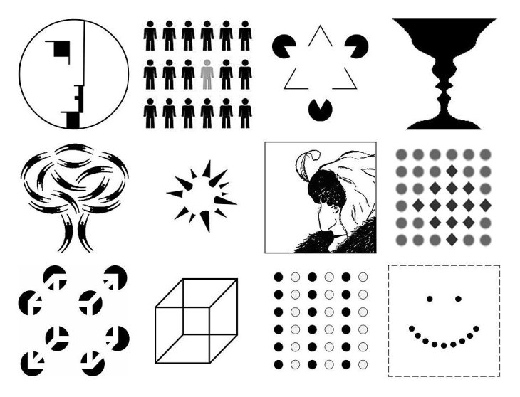
Last but not least, I will present the framework the authors came up with. The Gestalt principles are:
-Similarity: Elements tend to be part of a single group that share attributes that are perceived as similar.
-Continuation: Elements are grouped together when they present a unifying continuous patterns, this patters continuation is assumed even if not present.
-Focal Point: This principle refers to points in a display that attracts attention, or focus, on a particular element. This usually the case of an element on a group that is different from others.
-Figure-Ground: This dicotomy refers to the differentiation of foreground from a background that is intrinsic to human perception of information.
-Belongingness: This principle states that an element should belong to one source at a time, or be differentiated as two (or more) different elements.
-Balance: This principle refers to the equilibrium in which information is perceived. It can be symmetric (formal) or asymmetric (informal). These two core balances can be achieved by equally weighting elements in a sense. User’s tend to favor an equative distribution, but both symmetric or asymmetric balances can be desired in different contexts.
-Proximity: This principle says that elements group physically closed to each other will be grouped together.
-Common Fate: Similarly to the last principle, elements that share a same fate, change at the same velocity, or move at the same time and in the same direction, will be conceived as a single group to the human eye.
-Closure: The human mind will naturally fill in any missing information to complete already know patterns when some of the information received is hidden or missing.
Each of the principles mentioned above are subdivided in three senses (visual, auditory and haptic), and every single design guideline used in multi-sensory displays fall in one of these three subcategories inside one of the principles. According to the authors all principles are closely related and could be organized further into hierarchies.
Discussion
In my opinion this is a very interesting paper, once again theoretical concepts are combined with pragmatic implementations. This is extremely useful for interface and human computer interaction design. After all technology provides with multimedia information, and the way that the data is process and delivered to the user relies completely on human perception of information. We want to center our design on the user experience, this is what we need to know!
On relation to our project, our interface can benefit from applying this framework. We have a complete interface that will use visual displays (interface in the glasses) but will count with voice command and communication (voice recognition and sound) as auditory displays, the haptic factor can be also implemented on the physical design of the glasses, but we have not dwelled much on that, most of the haptic interaction is provided by the natural world surroundings, this is after all an argument reality interface. All these principles should be implemented to make sure our final interface conveys the information in a way that is easy to be perceived, ensures an intuitive and natural interface navigation, and an overall satisfactory user experience.
